
In this digital-first era, a website is no longer just a virtual storefront; it is also the main point of connection with your audience. Customers expect your website to be fast, visually appealing, and fully operable on any device. Through front-end web development, your website will not only look great but will also provide a seamless experience to your customers, irrespective of the device or screen size.
At Digital Hub Solution, we specialize in front-end website development that combines creativity, usability, and technology. In this blog, we will explore how to build a responsive website with the best practices in front-end development approaches and why this approach is critical for modern organizations.
Front-end web development is web development that focuses on what is visible to users and used within a browser. This includes the layout, design, presentation of text, and interactive aspects of a site. Unlike backend development, which manages the server, database, and logic, front-end development is all about user experience (UX) and interface design.
Front-end developers use technologies like HTML (HyperText Markup Language) for structure, CSS (Cascading Style Sheets) for styling, and JavaScript for interactivity and dynamic content.
Modern front-end website development also includes frameworks and libraries such as React, Angular, and Vue.js that simplify development as well as enable more dynamic and interactive websites.
Responsive design ensures that a website adapts seamlessly to different screen sizes, from desktops and laptops to tablets and smartphones. Since more than half of internet traffic is generated from mobile devices, companies can’t have websites that are only optimized on a desktop level.
Responsive websites provide a better user experience, improved search engine rankings, as well as greater chances of user interaction and conversion. Essentially, responsive design ensures that your website is accessible, appealing, and functional for every visitor, which is the central aim of any front-end development strategy.
Front-end web development of a website involves planning, design, coding, and testing. By blending design, functionality, and technical optimization, companies can easily boost their online potential. Thoughtful user experience and front-end design can ensure that your website drives traffic and converts it into loyal customers. Here is a step-by-step approach to building a responsive website:
Before writing any code, plan how your website should look and function on many devices. Our developers consider things like content flow and hierarchy, menu and navigation structure, visual aspects such as images, videos, buttons, and interaction patterns for touch devices.
We make use of tools like Figma, Sketch, or Adobe XD can be used to design wireframes as well as mockups of various screen sizes. This planning ensures that the front-end development process is efficient and organized.
Mobile-first design is a strategy where you design the smallest screen version first and then scale up to tablets and desktops. This approach helps in prioritizing content and functionality, which is critical for mobile users.
When you use front-end website development to create a mobile-first design, your CSS will include media queries to adjust layouts for larger screens. This ensures your website is fully responsive and user-friendly on all devices.
Writing clean, semantic HTML and CSS is important for both user experience and SEO. To optimize your front-end code, our professionals make use of semantic HTML tags to improve accessibility and search engine indexing. We also use CSS Flexbox and Grid to create flexible and adaptive layouts. Lastly, we aim to minimize JavaScript dependencies to reduce load times and improve performance.
Modern front-end development frameworks also allow you to modularize your code, which makes it easier to maintain and scale as your website grows.
Large images and media files can slow down your website, especially on mobile devices. That’s why you should compress images without losing quality, use adaptive images that adjust to screen resolution, and implement lazy loading for off-screen media.
These techniques improve page speed and improve the overall user experience, which is a key factor in front-end web development.
No two browsers view websites in a similar manner. During the front-end website development process, we test your website on a variety of different browsers, like Firefox, Chrome, Safari, and even Edge. This ensures that everyone has a similar experience.
You can diagnose layout and performance problems with browser developer tools. You should also consider polyfills or fallbacks for older browsers.
Testing is an ongoing part of front-end web development. You should test responsiveness on various devices, navigation, forms, and interactive features. By monitoring page loading speed/time and improving according to analytics and feedback, your website performance will improve a lot.
At Digital Hub Solution, we offer complete front-end website development solutions that make your website fast, responsive, and visually appealing. Our specialists focus on:
●Crafting user-friendly interfaces
●Mobile-first design and seamless user experiences on all devices
●Performance optimization
●Coding best practices to make your website efficient, scalable, and easy to manage.
If you are launching a new website or re-designing a current one, Digital Hub Solution's front-end development expertise will ensure that your site is future-ready and up to date with industry best practices.
In a highly competitive digital landscape, having a responsive website is essential. Front-end web development is the secret to providing smooth user experiences, better search engine rankings, and increased conversion levels. By focusing on responsive design, clean coding practices, and optimized media, businesses can ensure their websites meet the needs of modern users.
Digital Hub Solution provides top-notch front-end website development services to help your business stand out. From planning and design to coding, testing, and optimization, we deliver end-to-end solutions that make your website a powerful tool for growth.
Invest in professional front-end development today and ensure your website performs flawlessly on all devices. Contact us to get started!
 +919560508412
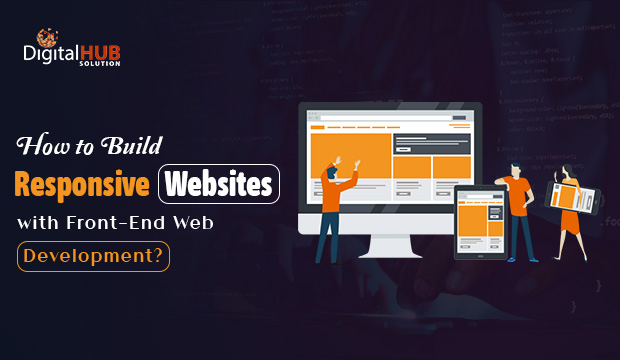


